Claire Edna Hurrey’s Artist Statement
New Mexico Landscape Paintings, 2015 – 2016
 My goal as an artist is to guide the viewer’s eye over the surface of my paintings of the New Mexican landscape. My intent is for the eye to travel across vast open space into the distance and return to the foreground, experiencing that space. My paintings are meant as visual statements in the exploration of the beauty and the balance of natural objects. Specifically, representing how their mass occupies that space, in the innumerable variations of weather and reflected light that create atmospheres of beauty.
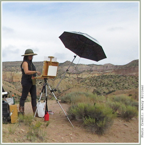
For these studio works, I’ve used both plein-air painting and photographs. Working en plein-air allows me to develop a direct relationship with the landscape. My presence in the landscape enables me to translate the experience of that immediate moment. Plein-air allows the comparison of colors and values in nature, which appear differently in photos. Naturally observed colors are brighter and values are deeper. Later, in the studio, the photos allow further study of the structure of the landscape without the many distractions of changing weather and moving light. I draw in the studio to map out and construct with understanding the solid forms that make up the landscape scene. I plan my composition, deciding how best to lead the viewer into the painting. Sometimes, I make models of the forms I’m painting, which inform my imagination and clarify the complexity of their three dimensionality. This helps me translate the three dimensional forms onto the two dimensional surface, including their correct values and shapes.
The palette of colors here is different than in my childhood state of Washington, where I painted for many years. My eyes are wide open to New Mexico’s vast and immense desert spaces, big skies, and dramatic clouds, set over red rock cliffs with deep violet shadows, all held together by the light of its arid air. The first colors I removed from my palette were raw umber and ultramarine blue, both too heavy in neutralizing the color mixture. The inherent red in ultramarine blue is fine for the moister atmosphere of Washington, but not for the thin dry air of this higher altitude. For blues I use cobalt, cerulean, and touches of phthalo.
As my own vision travels across immense spaces, over large colorful masses through atmospheres of beautiful light, I endeavor to share this with the viewer.
Many thanks to Della Clason Sperling for her fine editing of this statement.